
Your guide to the Ocellics Brand
Logo Files
The Ocellics logo is the cornerstone of our brand identity. It represents clarity, precision, and the flow of information.
-
Primary Logos: Our primary logo is Fund Data Services, with a distinct colour way that defines this business area.
-
Usage: Always use the official logo files provided. Maintain clear space around the logo equal to the height of the “O” in Ocellics. Do not stretch, rotate, or alter colours.
-
Backgrounds: Use the light version on white or neutral backgrounds, and the dark version on coloured or photographic backgrounds to ensure strong contrast and legibility.
Colours
Our colour palette is designed to be modern, vibrant, and flexible, reflecting innovation and trust.
-
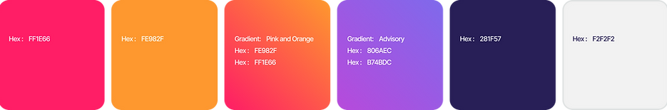
Primary Palette:
-
Red–Orange gradient for Fund Data Services
-
-
Supporting Colours: Dark navy for typography and neutral backgrounds, paired with white for clarity and balance.
-
Usage: Use gradients primarily within the logo mark, while flat colours support layouts and digital applications. Ensure accessibility by maintaining strong contrast ratios, especially for text.
Fund Data Services
Typography
Typography is a key element of Ocellics’ visual identity, ensuring clarity and a modern, professional tone.
-
Primary Typeface: Lato
-
Weights: Use Lato Bold for headings, Lato Regular for body copy, and Lato Medium for subheadings or callouts.
-
Usage: Always maintain consistent hierarchy. Headings should be clean and impactful, while body text should remain easy to read across digital and print applications. Avoid mixing in other typefaces to ensure a cohesive look across all touchpoints.

Linked In Banners
There are 2 linked in banner types:
One that includes both Ocelli's logos, FDS as well as Software Solutions, this banner is strictly for Director use of employees that are part of both companies.
The second logo is for all FDS employees, this logo only has the FDS logo on it.

